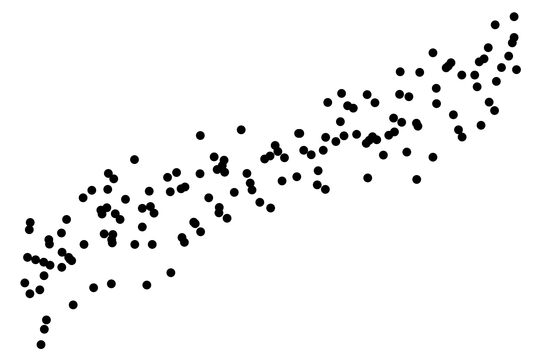
Rendering a scatter plot with Matplotlib
Here's how to generate linear-looking data1, visualize it with Matplotlib, and save it as a high-resolution PNG image. (Here's a Colab Notebook.)
import numpy as np
import matplotlib.pyplot as plt

# Generate data
amount = 150
X = 2 * np.random.rand(amount, 1)
y = 4 + 3 * X + np.random.randn(amount, 1)

# Make a scatter plot
figure = plt.figure()
ax = figure.add_axes([0,0,1,1])
ax.scatter(X, y, color='black')
ax.set_xlabel('X')
ax.set_ylabel('y')
ax.set_title('Linear regression')

# Save and display high-resolution plot
plt.axis('off')
plt.savefig(
  'plot.png',
  format='png',
  dpi=300,
  bbox_inches='tight',
  pad_inches=0
)
plt.show()
Hands-On Machine Learning with Sci-Kit Learn, Keras, and TensorFlow: Concepts, Tools, and Techniques to Build Intelligent Systems. 2nd Edition. Aurélien Géron. O'Reilly. 2019. ↩