Every requirement is an opportunity for delight, even the ugly ones. Sometimes the creative treatment of these warts are the most enjoyable parts of a design.
—Frank Chimero, The Shape of Design

Hey! Jose Luis and I will be running a workshop called Mind Ex Machina at the forthcoming SmartGeometry conference in Toronto (May 7–12, 2018). We will be exploring the creative potential of human-robot interfaces with machine intelligence. You should come!
SmartGeometry is a bi-annual workshop and conference which "[gathers] the global community of innovators and pioneers in the fields of architecture, design, and engineering."
Each year, the event takes place at a location around the world (previous locations include Gothenburg, Hong Kong, London, or Barcelona) and features a challenge to be tackled by each of the ten "clusters" that conform the Conference’s workshops.
This year's challenge—Machine Minds—will take place at the University of Toronto, Canada, May 7–12, 2018. The four-day workshop, May 7–10, will be followed by a two-day conference, May 11–12.
As mentioned before, this year, Jose Luis García del Castillo and I are leading the Mind Ex Machina cluster, which will explore the possibilities of creative human-robot interactions with the use of machine intelligence. Here is a more detailed description of our cluster's goals.
Robot programming interfaces are frequently developed to maximise performance, precision and efficiency in manufacturing environments, using procedural deterministic paradigms. While this is ideal for engineering tasks, it may become constraining in design contexts where flexibility, adaptability and a certain degree of indeterminacy are desired, in order to favour the exploratory nature of creative inquiry. This workshop will explore the possibilities of goal-oriented, non-deterministic real-time robot programming through Machine Intelligence (machine learning and artificial intelligence) in the context of collaborative design tasks. We argue that these new paradigms can be particularly fit for robot programming in creative contexts, and can help designers overcome the high entry barrier that robot programming typically features. Participants will be encouraged to explore this possibility through the conception and implementation of machine intelligence-aided interfaces for human-robot collaborative tasks.
Machine intelligence is becoming ubiquitous, and slick, complex mathematical models are being developed (and open sourced) to provide our machines with pieces of intelligence to perform a wide variety of tasks (from object or face or speech recognition to image style transfer, drawing, or even music composition).
It is our responsibility as architects, designers, and engineers, to envision how we will use these technologies in our own field, to explore new paradigms of interaction and discover their role in our creative processes.
Cluster applications for SmartGeometry 2018 are still open. (There are only a few spots left!) Take a look at all different clusters and sign up here. You can also keep track of our cluster's work on our private mailing list.
Earlier this month, we visited San Francisco. Before getting there, I created an illustration with Croquetilla as an Alcatraz prisoner (and placed it on a montage as a fugitive, and on a Wanted ad). Last week's update of the Croquetilla Stickers for iMessage includes this and other new illustrations.

Alcatraz's high-security prision remained open from 1934 to 1963. Apparently, it still remains a mystery whether the three only prisioners that ever managed to escape Alcatraz's high-security prision actually made it to firm land or if drowned in the water.
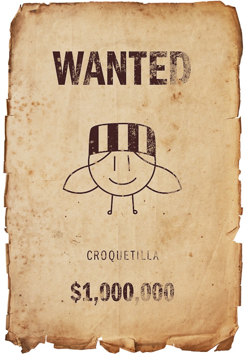
You can Download the Croquetilla Stickers for iMessage.
Happy Birthday Croquetilla!
I'm one week away from my master’s thesis presentation—Suggestive Drawing Among Human and Artificial Intelligences—which will take place on Wednesday May 10 at 11:20 am at the Harvard Graduate School of Design, room 123.
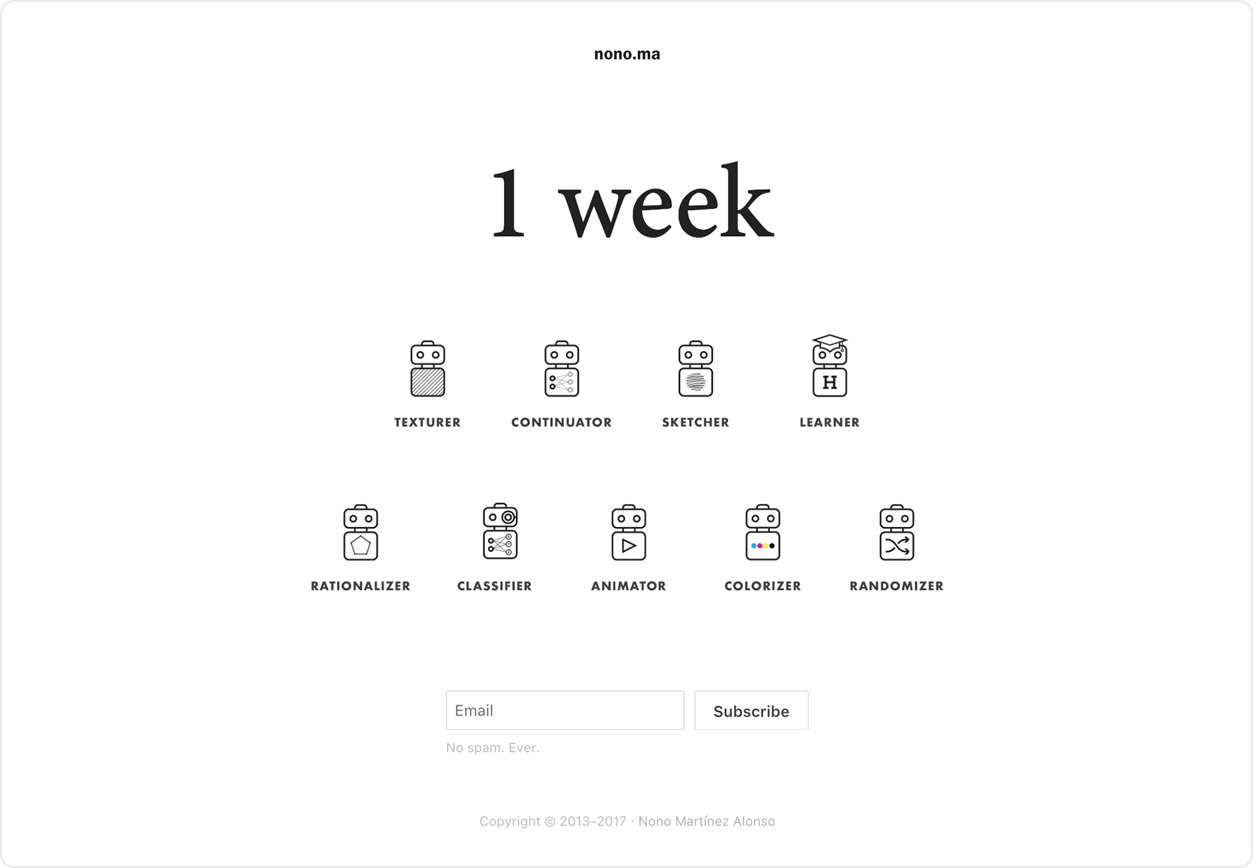
This teaser page features a countdown with an illustration of suggestive drawing bots—artificially-intelligent bots that help you draw.
Take a look and subscribe if you want to be notified when the project is released. (You can also just check nono.ma/ai in 7 to 10 days.)

First results of an on-going project to create a new visual identity for www.Lourdes.ac. I'm now trying to get away from it to resemble caligraphy books, and make it more like her artist signature.
This shot was posted on Dribbble.

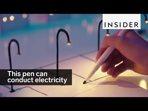
This pen—made by a Japanese startup named AgIC—is capable of drawing with a special kind of ink that conduces electricity. After a quick Google search, I found that it is sold on Amazon as the AgIC Circuit Maker Set for $53.
Efficiency facilitates the creative process by enabling more time for exploration as less time is needed for the final production. — Casey Reas & Chandler Williams, FORM+CODE in Design, Art, and Architecture
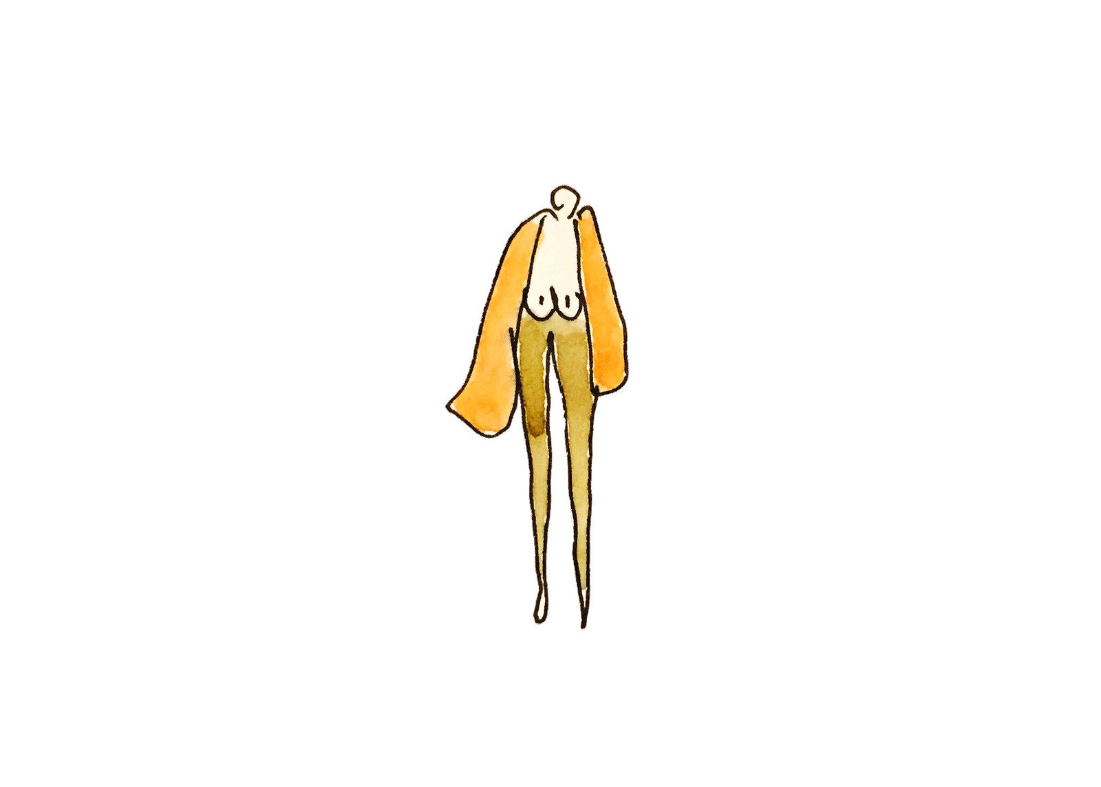
In a quest to keep learning and improving my design skills, I force myself to regularly practice designing graphics, sketches, art, typography, lettering, and other design-related stuff.
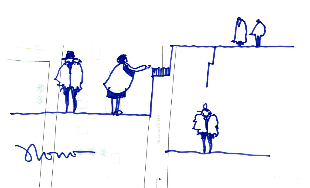
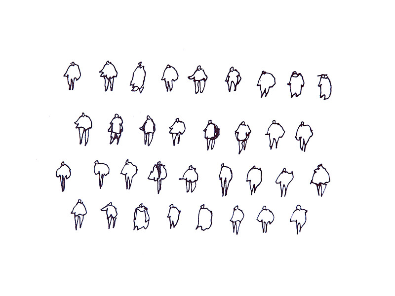
A side-project that arose from this deliberate design approach is The People Project—which has the sole objective of depicting people in their everyday life in extremely simple ways.
What you can see next is a small compilation of designs of the series produced between 2008 and 2015. I am preparing screen prints of this series and have an email list for those of you who want to keep track of the project. If that’s the case, join here.



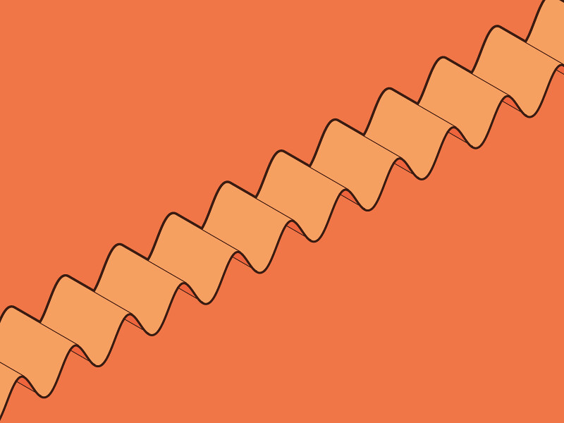
Posted a while ago on Dribbble, I was just having some fun with Grasshopper and Illustrator.
I started doing an M letter with the sin function, then repeated multiple times to obtain this result. Check out my other designs on Dribbble.
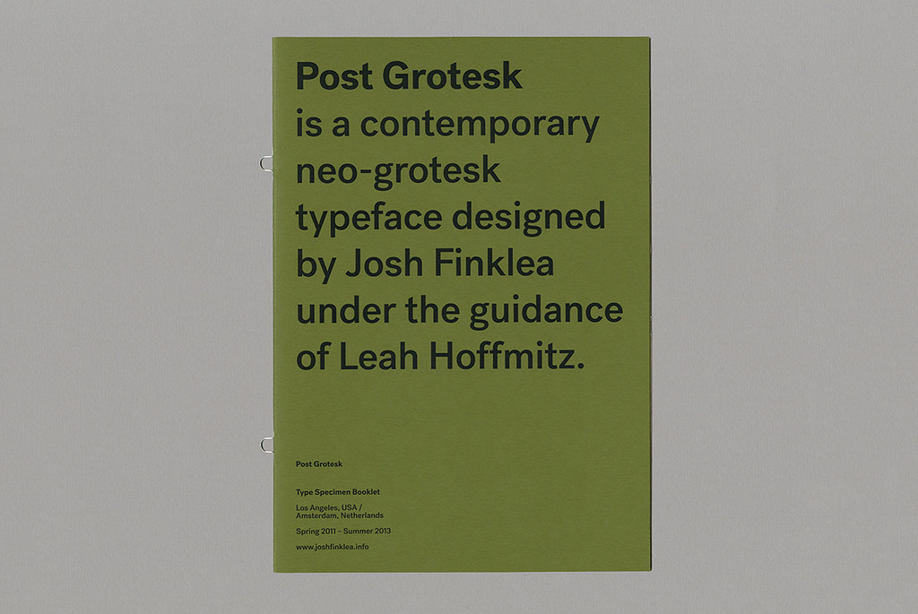
Post Grotesk is a contemporary neo-grotesk typeface designed by Josh Flinkea under the guidance of Leah Hoffmitz.

The development of Post Grotesk (originally Sonny Grotesque) began in the Spring of 2011 as a project to design a contemporary version of the traditional grotesque sans-serif. The intention was to build an amiable typeface with maximum usability and an overall sense of neutrality. Post Grotesk reduces the typical rigidness of a grotesk through subtle additions of personality and uniqueness.

It is available for purchase through the Village Incubator.
Life can be exciting, but falling into a boring routine is way too easy. No matter how important or relevant or exciting a project you have to do is, it can get you bored.
We frequently put a lot of hours in the same projects [maybe because we are told so by our bosses, or just because we want to] and, at some point, we get tired of doing the same thing over and over.
When we decide to create, we commit — or oblige — ourselves to create.
The commitment to perform a long task will, eventually, add a sense of obligation to your activity, removing all fun from it. But I believe you have a choice.
Splitting a project [or a given task] in smaller chunks can help. This way, you can jump from one task to another when you get tired — your brain considers each of those parts as different projects, as different things.
It is like leaving aside a whole project for a while, working on something new, and then coming back to it — something similar to what happens in our mind when we procrastiwork.
Framed this way, getting bored of a given piece of work is an option. While it requires some effort, boredom can [and should] be avoided. If you feel like getting bored is not an option, you may have to consider doing something else. Find stuff that doesn’t get you bored. Go somewhere else.
It is in our nature. We have a need to produce stuff. It does not seem to matter what it is that we produce, the important part is producing something. The judgement of others, or even our own judgement, is the reason why what we produce gets to be important, and how good the result is, leaving aside the process more often than we should.
In a world with so many talented people, high expectations freeze people. They stop people from getting a pen. And just because they know somebody else has, will, or is doing something better than them, somewhere else. But that is wrong. If you did not even try, how are you so sure your stuff is not better? Or, does it even matter if it is? I don’t believe so.
What you are willing to produce may have been done before, but your personality will always add a bit of originality to anything you do.
Frustration, though, comes due to the fake need to produce more and more, caused by our era, the digital. The Internet moves so quickly that when you clarify your concept, someone else has already funded the idea on Kickstarter.
The key: understanding there isn’t such a need to produce more and faster, but to produce wiser and better.
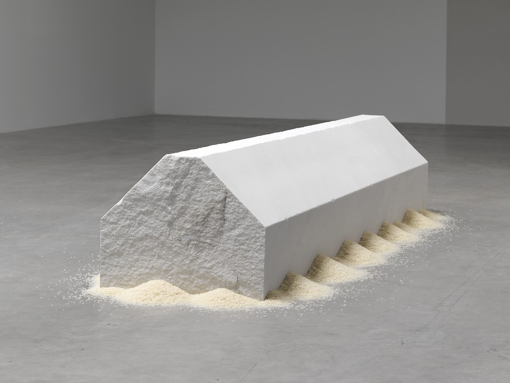
Made out of marble, the piece weights 1.500kg. More things by Wolfgang Laib here.
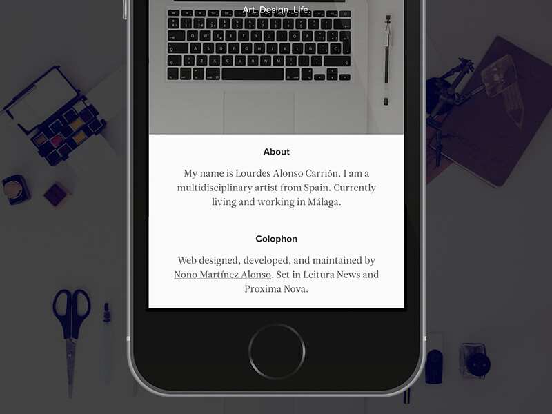
It's been a while since my last Dribbble shot, and here is the new version of the About Me page in Lourdes Alonso Carrión's portfolio.
Take a look at the @2x. It's a responsive design that uses CSSWizardry-Grids—so you may wanna check how it responses on desktop, lap, and palm sizes.

A simple concept that provides a different way to look at the time of the day.
Check out the live site at What Colour Is It.
And this is all its JavaScript code:
function dotime() {

$("body").css({"transition": "all 0.8s", "-webkit-transition": "all 0.8s"});

var d = new Date();
var hours = d.getHours();
var mins = d.getMinutes();
var secs = d.getSeconds();

if (hours < 10){hours = "0" + hours};
if (mins < 10){mins = "0" + mins};
if (secs < 10){secs = "0" + secs};

hours.toString();
mins.toString();
secs.toString();

var hex = "#" + hours + mins + secs;

$("#t").html(hours +" : "+ mins +" : "+ secs);
$("#h").html(hex);

document.body.style.background = hex;

setTimeout(function(){ dotime();}, 1000);
}
(via @daninatoli)

Is to leave them aside. To be connected to them—as a sketcher to her pencil or a painter to her brush—so the tool fades to let the creative focus on the design, instead of getting lost on the tools.
Knowing what you can do with each tool is essential to create. Otherwise, time disappears trying to master a tool rather than creating with it.
Knowing when to go back to pencil and paper—and concentrate in ideas—is important too.
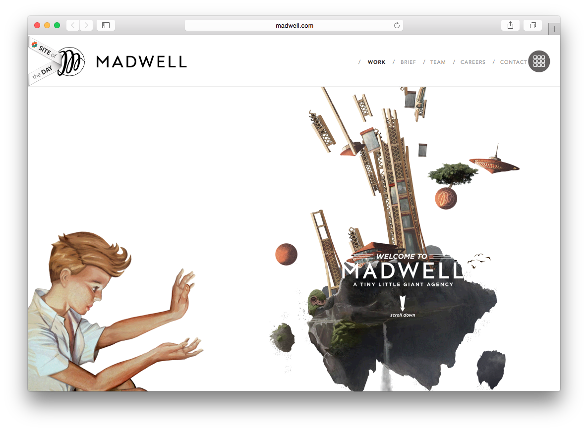
One of those websites that pushes the power of the parallax effect to its maximum.
Also, that is what the new Safari version inside OS Yosemite looks like, pretty neat.
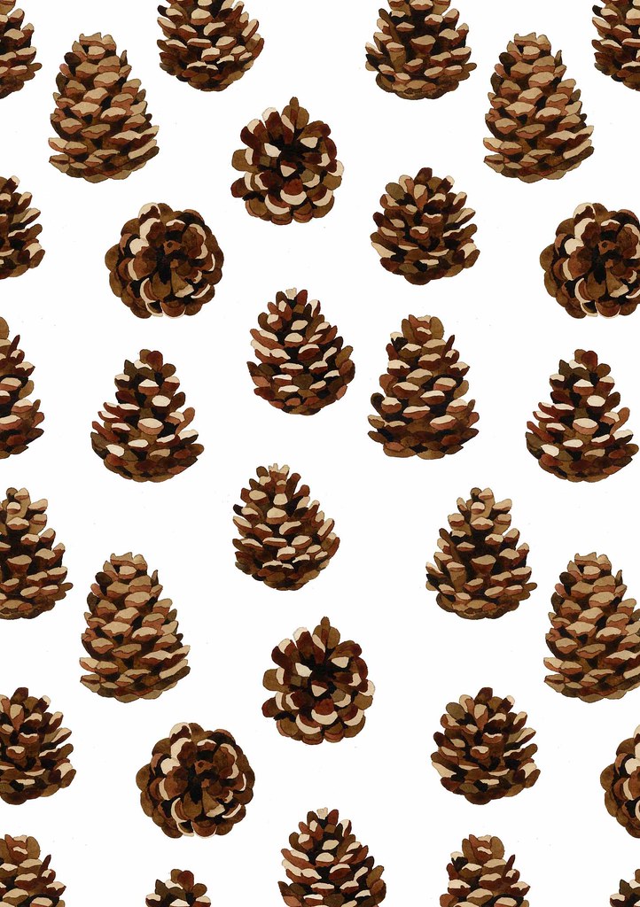
A nice design of January 2014 by Sophia Brabbins, a happy, hard working illustrator and surface pattern designer. Check more designs out on her website.
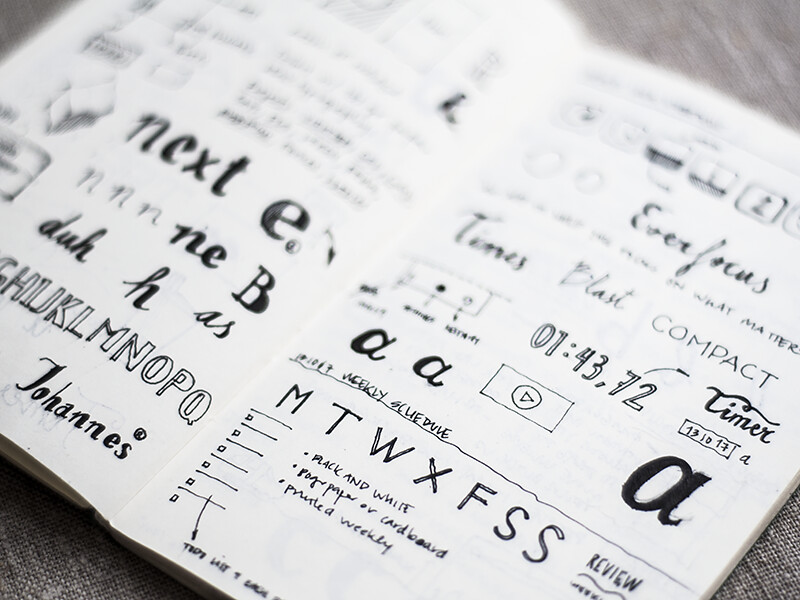
This post has three Dribbble shots that I have done over the last year in my Volant Moleskine. This first one has some type sketches, some early design ideas of Everfocus, and an idea for a Weekly Tasks calendar that I did later on.

Here are some sketches I did with two different thicknesses of the Staedtler Pigment Liner—0.05 and 0.4 mm— without any fixed purpose. Just deliberate practice.

Some more sketches. These ones are from a while ago, around June 18, 2014. This last shot was originally posted on Dribbble as a rebound of Custom Type, with some geometric shapes and annotations.

Artwork extracted from an architecture design iteration, part of my architecture degree's final project, which I submitted last June.
The result was obtained from a parametric model created with Grasshopper, transformed in a two-dimensional drawing with Rhino, and then formatted with Adobe Illustrator.
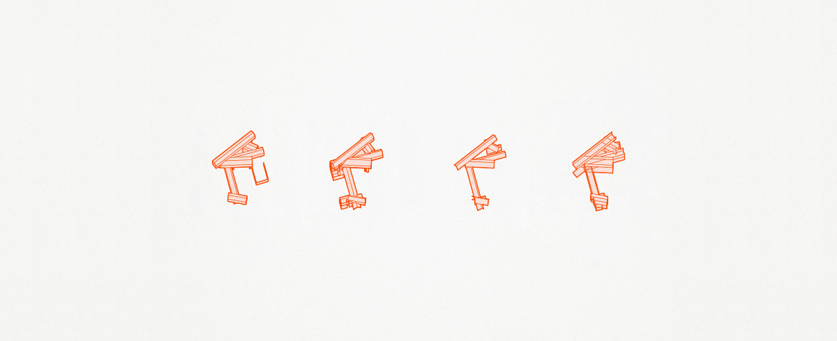
Having some action taken to get the feel of the product you want to make is a fundamental step before risking too much. As it happens in architecture and other creative fields, early prototypes help judge ideas, discarding bad ones and pushing forward the best ones.
The best way to have great ideas is having lots of ideas. — Linus Pauling
Ideas are just ideas. An idea can be formalized in many different ways. This is why, even though you have a concept to start with which is valid does not mean you are going to shape it in the correct way in your first try.
Iterate, abstract problems into small decisions which can be taken independently. For instance, if you are designing an appliance, two separate decisions could be its material and its shape. Even though one decision may affect the other, you could decide one ignoring the other. Abstracting problems makes evident which decisions need to be taken in order to move the ball forward.
Design methodologies do not work the same for everyone. But trying other people's processes of design can help you find your own. What do you think?
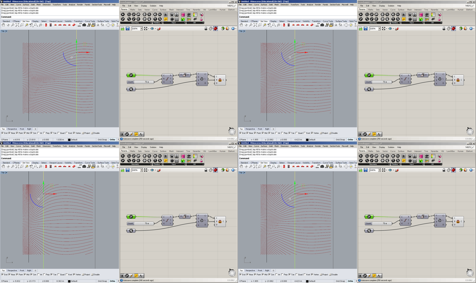
Last February, I shared my Compression design on Dribbble. The following screenshots illustrate the steps to generate the geometry. The curves were made using Rhino 5 and Grasshopper.
The whole design is parametric, as the geometry is based in modifiable parameters which can be altered after the design is finished to adjust the final result.
The parameters here are four lines, which can be moved in Rhino, rotated or scaled, and are referenced into the Grasshopper definition.

Then, the lines are subdivided in equidistant segments, with a parameter of the number of points. In this case, there are 76 segments on each line.
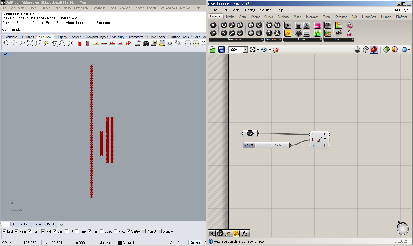
Using the Interpolate Curve component, the subdividing points are joined with spline curves.

Now, a surface created in Rhino is referenced in Grasshopper, which will act as our canvas, trimming the outer segments of the curves.

With the component Project, the curves are projected on the surface, and the outer segments disappear.


Now that the parametric definition is finished, we can adjust the initial parameters. This is, the initial lines and the amount of segments on each of them.

If you liked this post, please share it or let me know what you think. Thanks for reading!

The typeface you use in your slides matters. It talks about you and your business.
Myriad Pro is great. Yes, it is so good that it made it into the back of every single iPod, iPhone or iPad. But when you produce Illustrator work and use Myriad Pro, it does not talk good about you. It is the default font.
The same way, Calibri is a good typeface, but when you use it in an A4/Letter-sized document it shows up you did not spend even a minute thinking on what font to use for your document. You did not take a choice.
Even though ordinary people do not pay attention to design, and usually focus on content, there is people who cares about design that will be able to tell what kind of person you are, just by looking into the typeface, the layout and the elements present in your design work.
I always remember the following sentence by Jessica Hische, that says:
I’m a believer that if you have a favorite font, you’re probably using it inappropriately or way too often. — Jessica Hische on Thinking Thoughts.
Each typeface has its limits and its own voice.
The same way this happens with fonts in computer software, it occurs in other aspects of design. Before you ship something, think about what your design is saying about you.
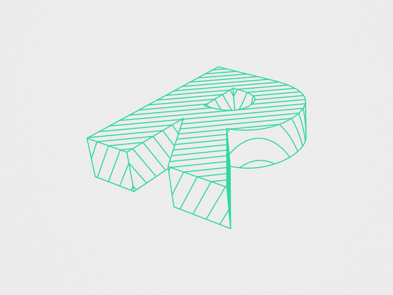
A design I did early this year, just for fun. Playing around with Rhino 5 and Grasshopper. Post-process was made in Adobe Illustrator and Photoshop.
An R letter set in Futura Bold was extruded and intersected by equidistant planes.
Made January 29th 2014, and posted today on Dribbble.
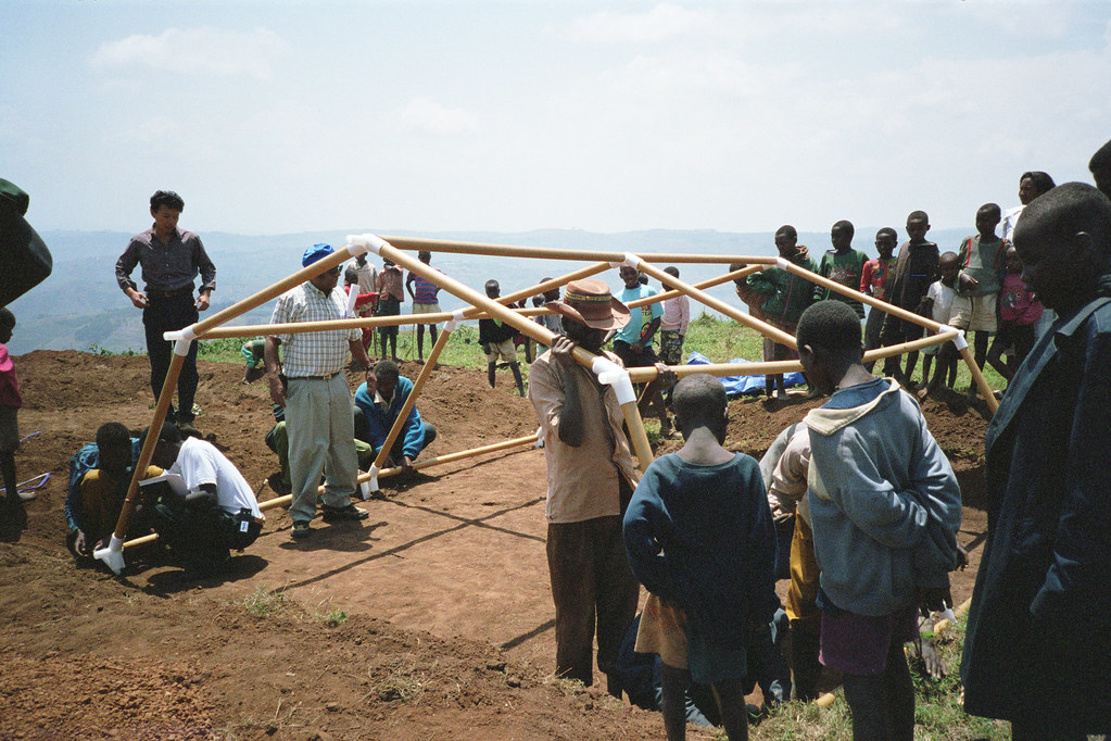
Shigeru Ban on 2014 Pritzker:
Receiving this prize is a great honor, and with it, I must be careful. I must continue to listen to the people I work for, in my private residential commissions and in my disaster relief work. I see this prize as encouragement for me to keep doing what I am doing – not to change what I am doing, but to grow.
The Japanese architect Shigeru Ban, who is the 2014 Pritzker Architecture Prize, has done numerous works which focus on economy and clever solutions to bring good architecture to places where high-tech solutions are not a possibility.

Last year, I personally had the chance to find amidst the chaos present in Christchurch, New Zealand, a Church made out of huge cardboard tubes.
You can check out more representative images here.